Craig Hellinger, UX Designer at Jadu Creative, blurs his screen, launches his screen reader and heads online to buy a Game of Thrones audiobook, documenting his experience for Global Accessibility Awareness Day.


As a front-end developer working for Jadu Creative, it’s my job to ensure that the websites we build for clients in local government, education and NGO (charity) sectors are not just beautiful to look at, but are also beautiful to listen to.
Wait… listen to?
Screen readers are used by those with visual impairments (providing information about text, icons, menus, etc). A recent assistive technology survey by .Gov found that 29% of respondents use them! Designing websites that are fully accessible to those using screen readers is of course absolutely imperative.
READ Accessibility: Like security, it's something we all own.
If you’ve never used a screen reader, the chances are you have at least listened to an audiobook. Listening to a book is not the same experience as physically holding the pages in your hand and looking at the words (beautifully rendered in 11pt serif type) but still conveys the text, right? You’re still experiencing the material, just in a slightly different way - that’s the same with screen readers.
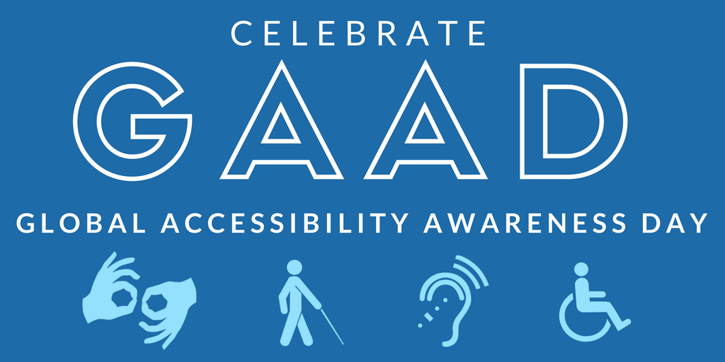
Ahead of Global Accessibility Awareness Day (tomorrow), I was asked to use a screen reader and document the experience. To continue my analogy, I decided I would use the experience to buy an audiobook.
I set myself the simple task of buying “A Game of Thrones” by George RR Martin.
I blurred the screen using ChromeLens, plugged in my headphones, and using my Apple MacBook with Google Chrome web browser installed, set myself the simple task of buying “A Game of Thrones” by George RR Martin. (Note: No spoilers in this post).
Luckily, I already know the keyboard shortcut to open Voiceover on my Mac; Command (CMD) + F5. I surmised that if I had a genuine visual impairment, I would probably know that too. Let’s say I didn’t know that. Perhaps I’m a Windows user and I’m more used to using Microsoft Narrator, or Jaws or NVDA or Orca etc. I’d need to click the tiny apple icon...
I’d need to click the tiny apple icon ...in the top left of my screen, open system preferences, hit the show all icon...
...click Accessibility, click Voiceover, check a tiny checkbox that says Enable Voiceover. Only now do I get an audible description of how to use the tool. The barrier to entry is already fairly steep.
I know that I can use CMD+TAB on my keyboard to bring my (already open) Chrome browser up. I’ve set my ChromeLens to ‘Partial Blindness (serious)’, which makes everything so blurred as to be completely unreadable. I am now part of an estimated population of 200+ million people worldwide with some degree of partial blindness.
A very polite well-spoken man informs me...
"Google Chrome. Chrome, New tab - Google Chrome, window, address and search bar, edit text"
He has a British accent (as do I), and he doesn’t sound like a voice synthesizer. So that’s a good start… but his opening gambit is certainly not a well formed sentence that I would get if there was a real-life human telling me what was going on. My expectations have been lowered.
I type the name of an audio book distributor that I know and hit enter. The page loads. No https or .co.uk needed. It goes straight to the UK version of the site. That’s good. My faithful assistant (let’s call him ‘Mac’) tells me that to view the web content I need to press "control-option-shift-down-arrow". I try various combinations of these keys but to no avail. It turns out I needed to press “caps-shift-down”.
Mac reads out the distributor’s cookie policy. I’m bored. I hit the right arrow key. The next text element is just a full stop. Nothing of interest here. If the designers had put the full stop inside the link that would have saved me a whole second of time.
I hit right again:
"Link: Learn more"
...says Mac. Learn more about what? I can assume from the previous context that we are still talking about cookies here. But I can’t be 100% sure.
The next item just says:
"Button: You are currently on a button inside web content"
Not very helpful. I lift the fog temporarily to see what this button actually is. Turns out it’s a close button for the cookie banner. Well why didn’t you just say so? This could have been done in several ways. Visually hidden text inside the button itself would be preferable (using a CSS trick), but even a title attribute or an aria-label would be better than a non-descriptive “button”. That means nothing.
I persevere.
"Banner"
This is actually just a wrapper for the site logo - but I’m left wondering if there is something I am missing.
"Navigation"
Ok, now we’re getting somewhere.
"List: two items"
"Link: Contact us 1 of 2"
Finally, something meaningful! But no, I think the distributor will be too busy to help me personally find my book. Fiercely independent, I’m going to try to do this myself.
"Link: Sign in 2 of 2"
Hmm. I don’t have an account yet.
"End of list"
"End of navigation"
"Link, image, company boilerplate"
Ah, so that’s where the logo is. I already know what site I’m on but it’s nice to be reassured. I hit the right arrow key again. This is where it gets interesting. Mac says:
"Search for an audiobook, newspaper, magazine and more, search"
Fantastic. I type it in: “game of thrones”.
"Listen to Game of Thrones audiobooks vertical line [the service] co uk"
...replies Mac. I’m pretty sure I’ll have to buy it first, but sounds promising. I then have to go through the entire tiresome process of skipping through the cookie banner, logo and contact / account navigation again to get to the content. Bear in mind that without taking a sneak peak earlier I would have no idea that I could actually close this cookie banner for good.
Perhaps a hidden `skip to content` link would have helped here to avoid repetition? One of the accessibility testing tools we use in Jadu Creative (Siteimprove) would have flagged that as an issue straight away.
After skipping past the logo, Mac informs me of a new element that I don’t recognise from the homepage:
"Collapsed menu popup link, browse 1 of 3"
It turns out that this is a mega menu containing a completely different navigation experience for those shoppers who are just browsing (no pun intended).
You’ll notice that the screen reader has read out the word collapsed to inform me that there is much more to be explored here. The front-end developer in me kicks in and I inspect the code. It turns out the developers of the site have added aria-haspopup="true" and aria-expanded="false" to the ‘Browse’ button - which is how it knows that this is a collapsible menu.
It also shows me that accessibility has indeed been considered during the making of this site. Which is what you would expect from a competent, well-known organisation . So why, so far, has the experience of navigating the site been so frustrating? Were the designers just ticking boxes and forgetting to tick the most important ones? Most likely they never actually put themselves in the shoes of someone who actually uses their site.
I continue to navigate past the header until I get to the main site content.
Now the frustration continues. My screen reader only allows me to use the right arrow or tab key to skip to the next element or link on the page. The way the code of the site is structured means that the sidebar comes before the main content column in the order that the page is written.
I have to skip past 48 separate items...
With no way to quickly skip past this sidebar filter navigation, and with limited visual clues as to what these links are, I have to skip past 48 separate items before I can get to the first blurry box that looks like a product that I can buy. NO I DO NOT WANT TO BUY THIS BOOK IN SPANISH, CHINESE OR GERMAN!!!
Once I get to the first product, The actual link to the product “more info” page has no text in it - so the screen reader just reads out the alt text of the image. Better than nothing, and it contains enough information for me to determine what the product is. But it reads it out in a strange synthesized American accent - which is a bit jarring. Where has Mac gone?
The next few links just read out:
"George R. R. Martin"
"Roy Dotrice"
If I just tab between them there is nothing to explain to me that one is the author and one is the narrator. Some visually hidden text would have certainly helped here.
I finally reach my big yellow call to action button. Mac tells me:
"Link free with 30-day trial"
Not exactly a clearly defined call to action. There is an awkward pause before the screen reader reads the title tag.
"Learn how to get a game of thrones free"
This is enough information for me to click the button and sign up for my free trial. Woohoo! I didn’t even have to pay for it. Despite the difficulties, I have completed the task. I haven’t had to ask someone else to do it for me. And now I can truly appreciate one of the pleasures in life that someone with limited vision may otherwise have missed out on.
I have just tried one audiobook distributor here. There are many other websites out there that are trying to provide a more inclusive service for their users, and are coming up short.
If you are a website owner, content editor, designer or developer, I hope that reading this has inspired you to pay a bit more attention to your visually impaired users next time you make a design decision on your site.
The reasons for doing so are much clearer when you experience the frustrations firsthand.
FIND OUT MORE: Accessibility Training and Information
Leave a comment