Rob Newth, UX Front-end Developer, Jadu Creative, unplugs his mouse, heads online and documents his experience using just a keyboard, in the lead up to Global Accessibility Awareness Day.

Accessibility is taken very seriously here at Jadu and Jadu Creative and we routinely stress its importance to those we work with.
READ Accessibility: Like security, it's something we all own.
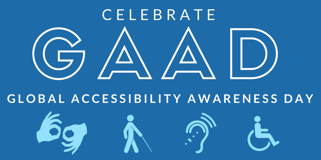
A big part of accessible design is putting yourself fully in the shoes of the people you’re designing for. So, when asked to do ‘Mouseless Monday’ (including no touch pads and the like) ahead of Global Accessibility Awareness Day on Thursday, it was a no brainer.
The challenge? Use just the keyboard (tab/shift tab, arrow keys, enter and spacebar) to navigate and interact with websites and applications.
Believe me, every time it’s an eye opening experience. It's worth trying for yourself!
If your experience is anything like mine, the results will be mixed at best, and that’s just not good enough!
I unplugged the mouse and headed over to a large online retailer and, to be fair, the overall experience was pretty good. I was able to clearly tab through the menu items, along with most of the content. There was the option to “skip to main content”, which improved the speed and overall ease of use when visiting multiple pages.
Browsing wasn’t the problem, this came when adding items to the basket. There was no clear indication that they’d been added; a loading icon simply appeared and then disappeared. It would have made much more sense to be scrolled up to the basket icon or for the basket to be visible at all times.
There were some slight discrepancies between pages. On some, the filter sidebar was the first tabbed item, and on others it was the skip link and menu items. It was a little inconsistent and confusing - but overall this would be my most positive experience of the entire exercise.
I moved onto a second retailer, which provided a great keyboard experience, but had issues in the form of information tooltips that only worked on mouseover. The third provided no way of showing the sub menu items and had no skip links, resulting in a limited, long winded experience.
Over to an online auction site and the overall experience was not bad, but some pages wouldn’t allow me to skip the content - so it became time consuming and frustrating to get to the main content. There were also a lot of filters to tab through before getting to the content.
...I wanted to filter the items by size/colour etc, (but) the functionality simply didn’t work.
Onto some fashion sites and issues began coming thick and fast. One site worked fairly well, providing skip links and focus states but when I wanted to filter the items by size/colour etc, the functionality simply didn’t work. It’s a very time consuming task to shop without such categorisation.
Another website had no focus states whatsoever, so was entirely unusable. One had focus states right up until I got to the products, making it unusable too.
Visiting two news websites gave two completely different experiences. One was extremely good, offering skip links, focus states and even accessibility help. The other had no skip links, forcing the user to tab through the long menu every time. There was a large cookie banner which obscured a large portion of the bottom of the page. This covered content that I was tabbing to, and there was no way to close this other than with the mouse. This website used a ‘lazy load’ feature, which forced me to keep tabbing and tabbing to load more content. There was an advert playing in the bottom corner that I wasn’t able to tab to close.
I visited four holiday booking sites and was only able to use one without a mouse. This was because two of them show a ‘sign up’ pop-up, which appeared over the page, which wasn’t in focus so I could only tab items underneath it.
There were no skip links and very long filters that couldn’t be skipped past, so it was far from the ideal experience.
Another had no focus states, so I had no idea what I was tabbing to. The only site that I could use wasn’t without issue. There were no skip links and very long filters that couldn’t be skipped past, so it was far from the ideal experience.
Visiting two well-known energy suppliers, I found one wouldn’t let me tab through the menu at all, and the other had no focus states on form elements. Online grocery stores provided a mixed experience, with one working very well, containing skip links, focus states and working filters. The other worked well until tabbing to the products and then became unusable.
From just a small amount of time exploring the web using just the keyboard, it’s clear that a lot of work still needs to be done. Some websites are incredibly restricting and often unusable.
This needs to change.
I would fully advocate trying this exercise by going mouseless for a period of time. If your experience is anything like mine, the results will be mixed at best, and that’s just not good enough!
FIND OUT MORE: Accessibility Training and Information
Leave a comment