Components
There are a number of components that you can select from which will determine the way in which your end user will provide their answer to your question. Often, the appropriate component is dictated by the question itself, but it is worth taking time to carefully plan which components you wish to use.
Text Field
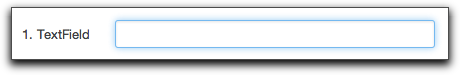
This is an input box within which a visitor can enter a single line of text. It is ideally suited to capturing information such as names, telephone number, email addresses, etc.
Text Area
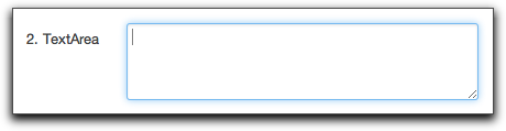
This is similar to a text field, but is designed for capturing larger responses. If your question needs a longer, typed response such as comments or feedback, then you should choose this component.
Checkbox
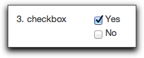
If you want your visitor to select from a number of options, from which they can select more than one response, then a checkbox should be the component type that you choose.
Due to this being a 'multiple choice' type component, further inputs will be made visible at the bottom of the page for you to provide the set of options that the end user can pick from.
Radio button
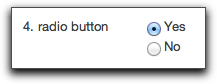
If you want your visitor to select from a number of options, but they are only able to give one response, then a radio button could be the option that you choose.
Due to this being a 'multiple choice' type component, further inputs will be made visible at the bottom of the page for you to provide the set of options that the end user can pick from.
Note: to ensure the user does provide an answer, you can either select a default option, or set this question as being required.
Dropdown menu
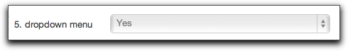
If you want your visitor to select from a larger number of options than would suitably display inline within the form page, but to only give one response, then a dropdown could be the option that you choose.
Due to this being a 'multiple choice' type component, further inputs will be made visible at the bottom of the page for you to provide the set of options that the end user can pick from.
Password
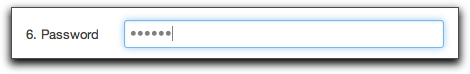
This has all the same options as a normal text input field, except that to the end user, the characters will appear as asterisks (**) as they type, so as to prevent anyone watching the user fill in the from learning a password, for example. You should always use this when asking for a password for security reasons.
Table
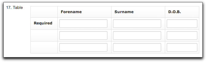
Jadu XFP provides you with the flexibility to create a Table combining a number of form components into a tabular format. An example of this might be when collecting details of household members and wanting each person's forename, surname, and date of birth.
Questions asked within Tables are structured within columns. The number of residents (maximum) to gather following with this example could then be set to be 3 by setting the Number of Rows to 3. You can then specify the number that are required (minimum) with the Required Rows dropdown. Therefore, you could specify that at least 1 person’s details must be supplied within the table.
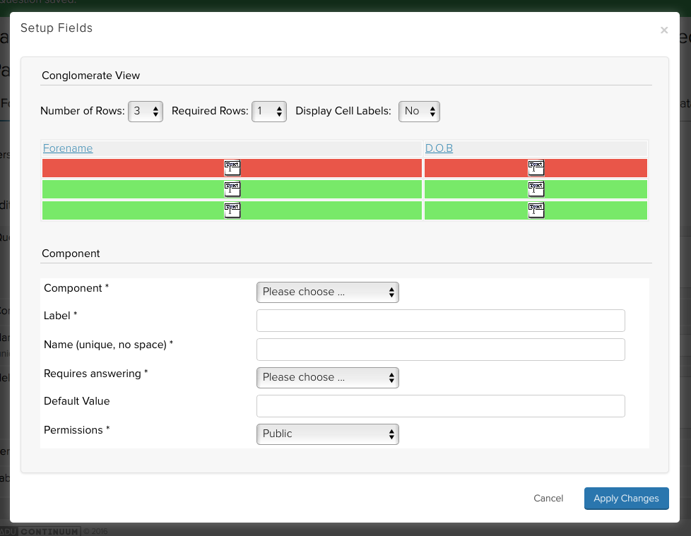
Table Settings displayed after clicking Setup Fields
The total Number of Rows can be set from 1 up to 25. The Required Rows can be set from 0 to whatever is specified as the Number of Rows. You can also decide whether to show or hide the question text within each of the cells. Use the Display Cell Labels dropdown to turn on or off the output of labels.
Table validation adopts the following conventions:
| Condition | Result |
|---|---|
| Row Not Required, None of the Columns Required | The end user can enter, all, none or some responses into the table columns for this row. |
| Row Required, None of the Columns Required | The end user can enter none or some responses into this row. |
| Row Not Required, Some or All Columns Required | The end user can enter no responses into this row or if the user enters a response all required columns must be completed. |
| Row Required, Some or All Columns Required | The end user is required to provide responses to all required columns in this row. |
All question inputs must validate against the validation routine assigned to the question within a particular column.
Columns can be shifted left and right, removed or updated as necessary after clicking Setup Fields and choosing the column/question to be edited.
Note: It is not possible to use the following components within a table; Integrated Components and File Uploads.
File Upload
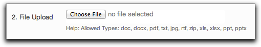
This component allows end users to upload files as part of their form submission. There is no additional configuration required in terms of setting up the question itself.
There is, however, underlying system configuration that imposes various limitations on what file types the end user is allowed to upload. The Jadu platform configurable options are:
- File types allowed to be uploaded within standard configuration allows: 'doc', 'docx', 'pdf', 'txt', 'jpg', 'rtf', 'zip', 'xls', 'xlsx', 'ppt', 'pptx'
- Attaching uploaded files to any email alerts that contain the file upload question. Standard configuration is set to 'true' to allow this. This should be disabled if you have no virus checking capabilities.
- Depending on the system's implementation, include the allowed file upload size.
Changes to any of these will need to be discussed with your systems administrator and subsequently, Jadu Support if deemed necessary.
Note: The File Upload component is not supported when used in Preview mode and there is no validation on unsupported file types in this mode.
Calculation
Calculations allow you to collect a value as part of the form completion process that may not have come from direct user input. This could be as a result of some other input provided by the user, or from a formula that you define when setting up the question. You can determine whether the user sees the calculated value or whether it stays hidden within the form submission.
Additional settings for the question when setting up a Calculation include:
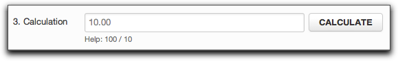
Formula: The formula that will be used to determine the calculated value. This can either be 'Custom' (default), or a predefined calculation. This is determined by the drop down at the top of the formula field.
If 'Custom' is selected, the Administrator can enter their own formula into the provided text area. This can include static numeric values e.g. 20 to represent VAT or sales tax for example, and can use responses to existing answers supplied by the user in their responses prior to the current page. Variables can be inserted by double clicking the variables from the Variables list displayed with the basic formula operators "+", "-" etc. e.g. "([Response - Car_worth_today] / 100) * 12.75" would calculate the amount of depreciation for a car next year. When using a Calculation within the column question within a table component, it is also possible to build up Microsoft Excel style calculations through the exposed variables. These variables consist of those for the Current Row (good for using when calculating something based on values entered in the current row only) or a specifically numbered row (good for adding up all the row totals), so that you could have a Calculation for each row, and then a Calculation question after the table which summed up all the calculations to provide a grand total. Depending upon your system’s configuration it is also possible to add PHP scripting within the Formula area, with the result being applied to the $calculationResult variable. Please see the Jadu Developer Guide for further information on this capability.
If a pre-defined calculation is chosen, the Adminustrator will need to map any fields that display for the calculation to work as expected. These mappings can either be an answer to a question, form variable or manual text. XFP provides a selection of useful pre-defined calculations, but these can be added to via custom developments. For advice on how to do this, see the XFP Developer Guide.
Precision: The precision to which to provide the resulting calculation after the formula has been processed, e.g. 2 decimal places would round the result to two decimal places for a monetary value.
- Editable: Whether or not the end user can edit the amount that has been calculated. Useful for when calculating a suggested amount, but the end user can later amend the value as necessary before submitting it.
- Visible: Whether or not the Calculation should be displayed to the end user or not when completing the form. If visible, the Calculate button will be automatically added to the form by XFP.
Once Calculation has been set as your question type, the user interface will change to provide all of the above options, as shown below.
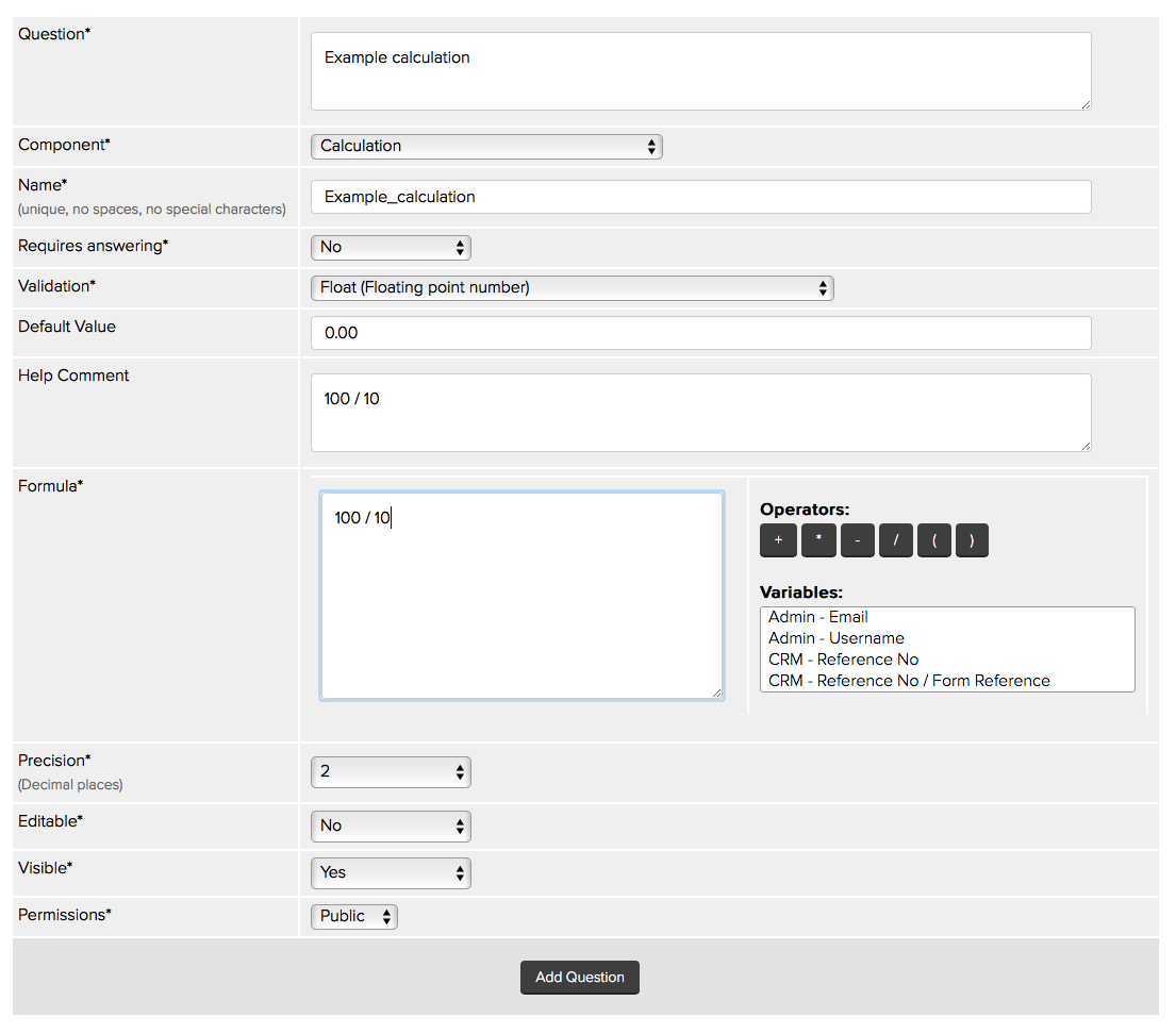
Calculation Question settings
Note: Warning messages associated with Calculation components will not be displayed when used inside a Table component.
Hidden text
This is a text field that is not visible to the form user. It enables the form designer to pass information along with a form submission that is not seen by the end user e.g. a reference code. To use a hidden text component you must supply a default value and a validation routine.
Hidden text component values will appear in an Email alert where the '[Form - All Questions/Answers]' variable is included. If you do not wish hidden values to appear in an Email alert, instead use the '[Form - All Visible Questions/Answers]' variable within the email body. Email alerts are discussed in Chapter Six of this manual.
Email confirmation
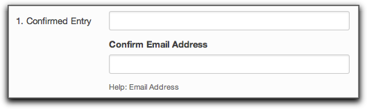
The Email confirmation integrated component forces the end user to enter their email address a first time, and then confirm that input a second time. The two entries are checked against one another to make sure they are an exact match. The initial input box is also validated against the email validation routine. Copying and pasting is disabled on this component in Internet Explorer 6+, FireFox 3+, Safari and Chrome. Disabling copy and paste is implemented through JavaScript, therefore if JavaScript is disabled this functionality fails gracefully and will allow the user to copy and paste.
Event Booking
See Event Booking.